A Post By: Oded Wagenstein
As part of my series on portrait photography, in this article, I will discuss composition, one of the most important aspects of creating a good portrait image.

- Are there any laws regarding framing a portrait?
- Can I leave hands, fingers, or part of the head out of the frame?
- Does a portrait have to include a face?
I will answer these questions that my students often ask. It is important to keep in mind that as in all aspects of art, there are no “rules” or “must dos” here, because you can do anything as long as it works for you. So, I will describe techniques that work for me and I hope that they will work for you, resulting in much stronger portrait photography portfolio.
What is a good portrait?
A good portrait is an image of a person that manages to tell a story. A good portrait evokes emotion. A good portrait tells us something about the person in the image, and composition is a key element that helps us create a storytelling portrait.
How can I create a storytelling portrait with the help of composition?
I think good composition is a combination of the scene on the ground and the scene within your head. It combines the available with the desirable.
Here are a few examples of portraits I made recently (using natural light only) with explanations of the thinking process and goals in terms of composition. As Ansel Adams said, don’t forget that every image has two people behind it. the photographer and the viewer. So you might not feel the same emotions as I do with the images I created. But that’s okay, because photography is both an art and a science.
Choosing how much background to include

Focal length 24mm
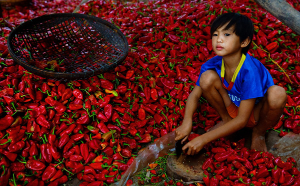
I met this boy cutting Paprika in rural Cambodia. It was summer vacation and he was there with his family and other villagers. What’s my visual narrative in one line? “Small boy, big work.”
I immediately knew two things: one, the background is a significant element and two; I wanted to capture the boy working alone. So, I started with the background and decided on a high angle in order to capture this “mountain” of Paprika. It was important for me to show the boy’s entire body with some space above his head so that the viewer could compare (remember my one line story?) the size of the boy to the size of the work.
I even included that basket in the composition to add balance to the entire frame. After I set up my composition, I waited about 20 minutes to capture the boy looking up. I knew that if he was working with his head and eyes down, the whole story would fall apart. I think the wait was worth it.